A one-word brief, and the finished thing
Solera was an automotive-data company built by acquisition, with new sub-brands arriving faster than anyone could write creative guidance for them. The brief was often a single word. The work still had to ship, in whatever register that week's company needed.
.avif)
Direction is a luxury. The skill that matters when there isn't any is turning “techy,” “dark,” or “Halloween” into a finished piece that looks like it was always the plan.
- Role
- Visual Communication Designer
- For
- Solera Holdings and its sub-brands, including R3PI and iATN
- Tools
- Illustrator, Photoshop, InDesign
- Years
- 2014–2016
Why this work mattered
A large company that moved like a startup, and a design team that had to supply the direction itself.
ContextSolera Holdings sold automotive data and insurance technology, and it grew by acquiring smaller companies. Each one arrived with its own audience, products, and half-formed identity, and the same team of brand managers, social media, and web specialists produced work for all of them. There was no formal art direction function. A request was a theme and a deadline.
That shaped the job. Every piece here started from almost nothing and had to land as professional, on-brand work: illustration for social feeds, a recruiting banner for a new innovation lab, a save-the-date from the CEO's office, an office Halloween campaign, concepts for products that were still being argued about. The range is the point. It is what "self-directed" looks like as a deliverable.
Illustration and concept art
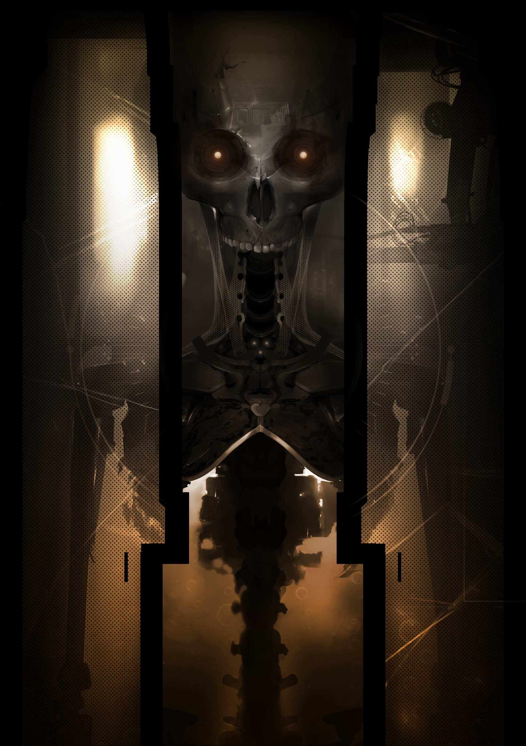
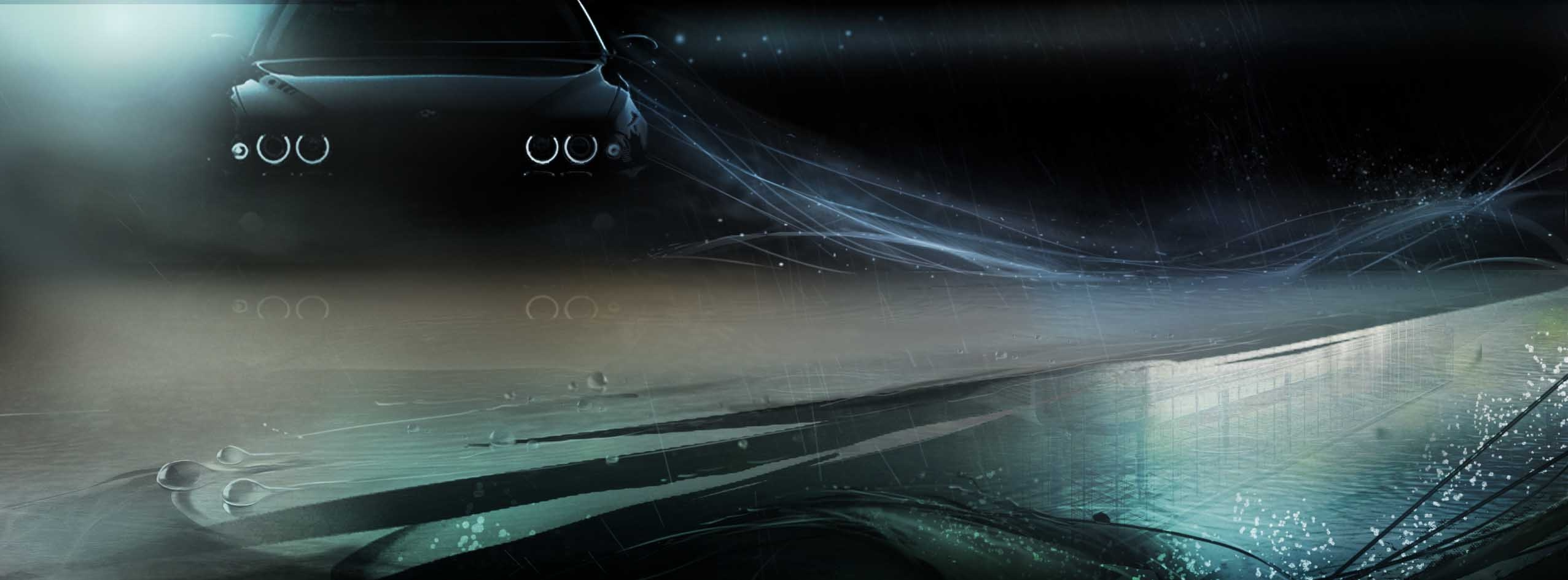
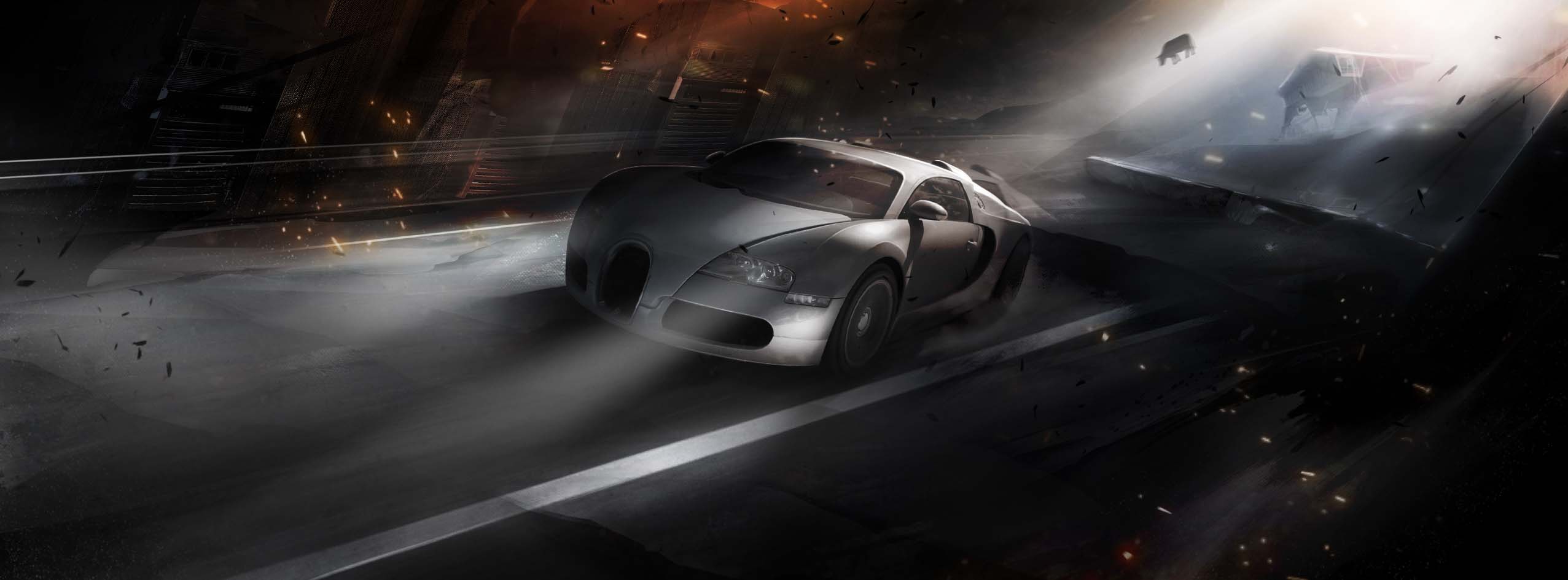
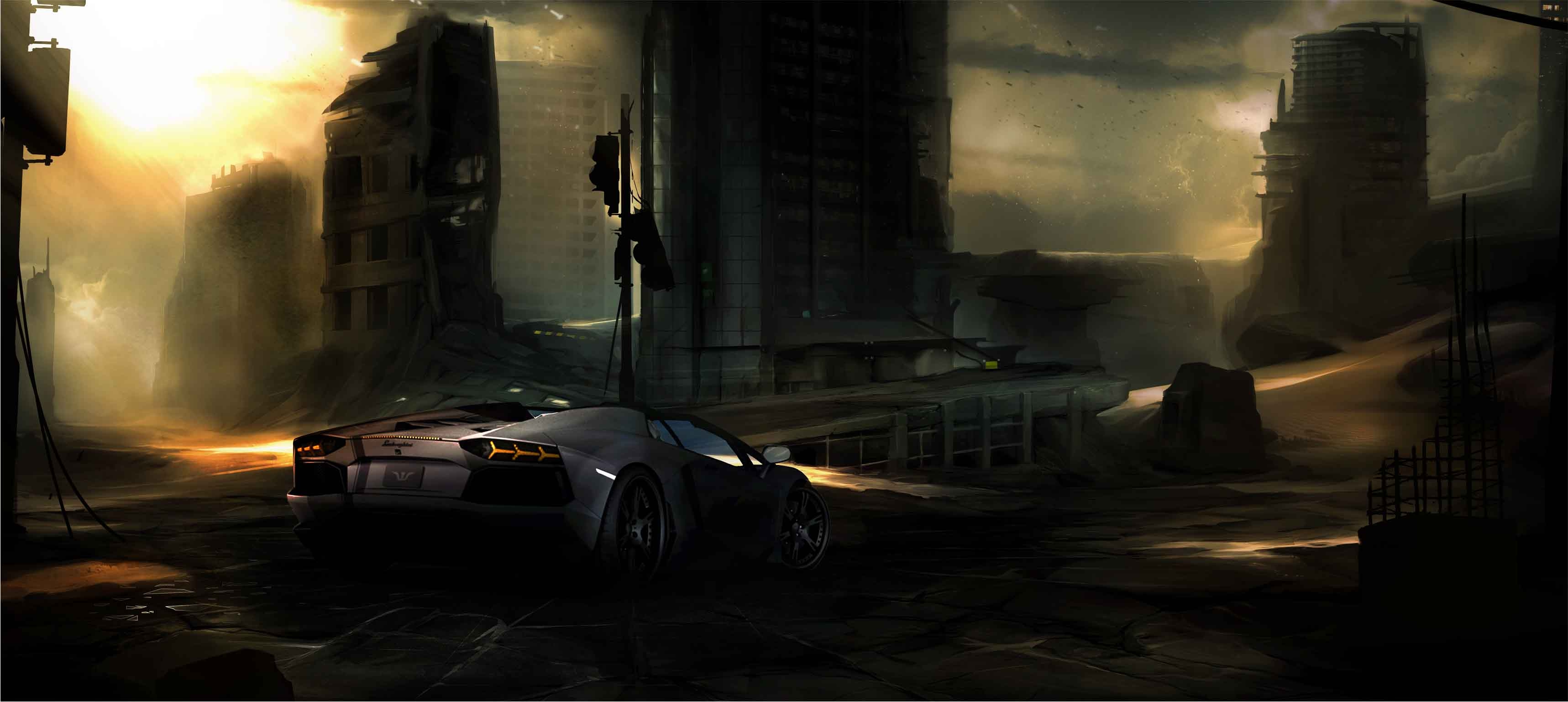
Made for social channels. All of it original: painted and modeled, not stock, not composited from stock.
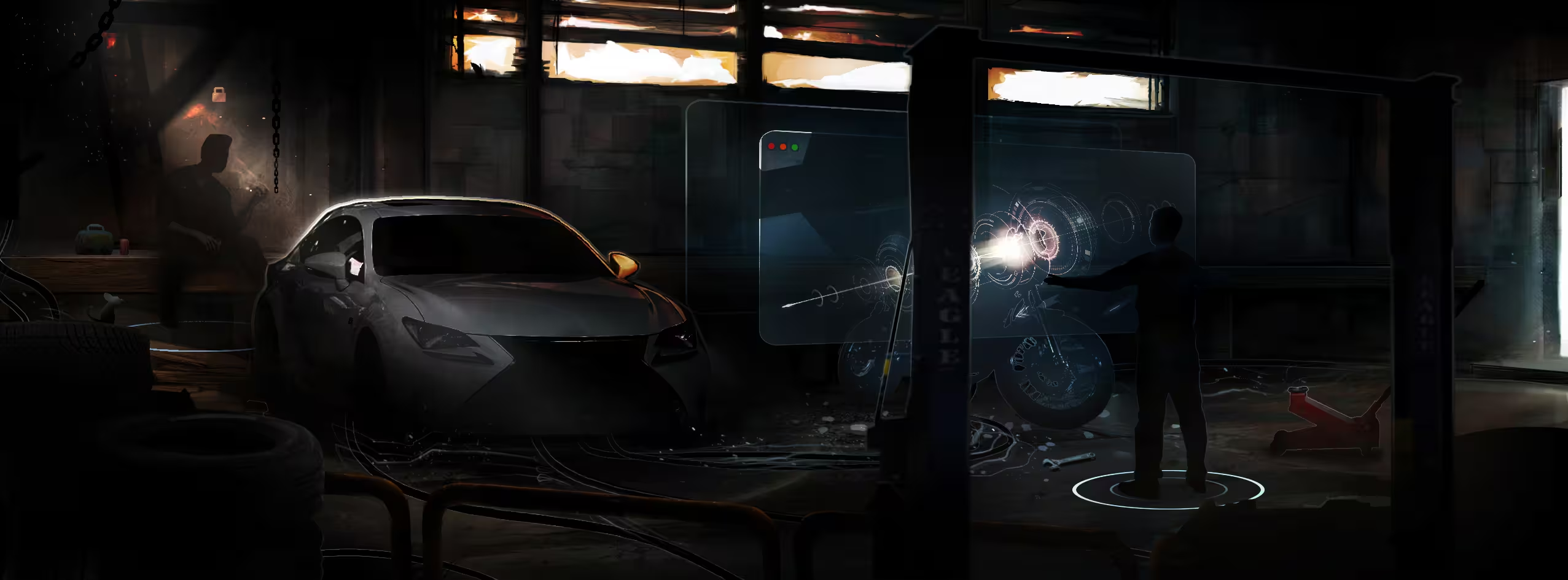
Seven piecesThe social team needed imagery that felt like the company wanted to feel, automotive and forward-looking, with a sci-fi edge. With no reference to work from, I made it: cars in weather and light, a rider, a helmet, a ruined city. These set the visual temperature for the feeds, and they are the register the R3PI banner later borrowed.

R3PI: from brief to banner
A recruiting banner for Solera's innovation lab, shown with the three versions that came before it and the day it stood in a room.
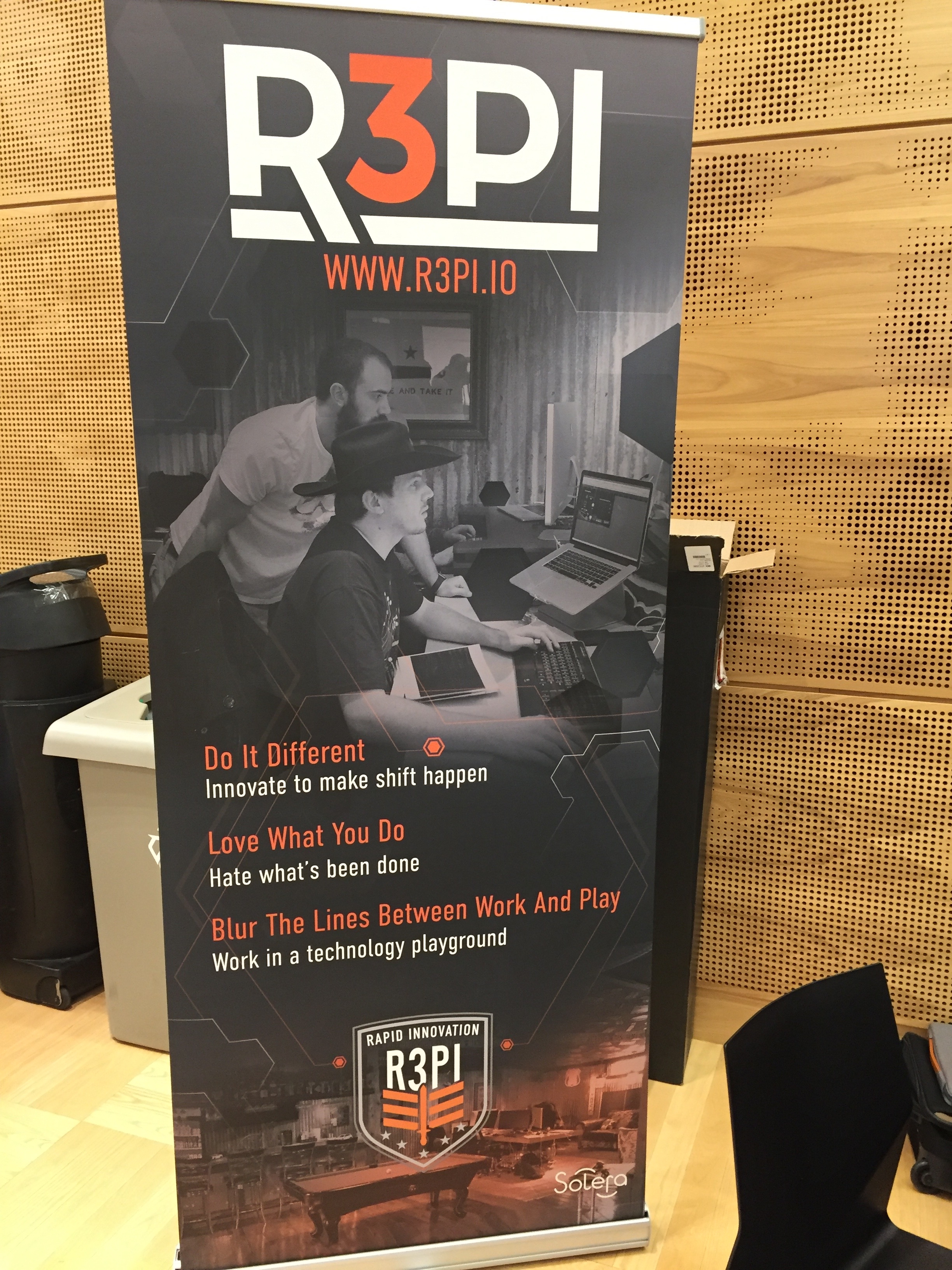
The process storyR3PI was Solera's rapid-innovation lab, and it needed a pull-up banner that would recruit engineers at events. The brief was the name, the URL, and the fact that it should feel like a startup inside a large company. What you see below is the actual sequence: a loud first pass that led with attitude, a darker second that added people and place, a third that sharpened the ask, and the one that shipped, which kept the photograph and the three-line manifesto and let everything else go.
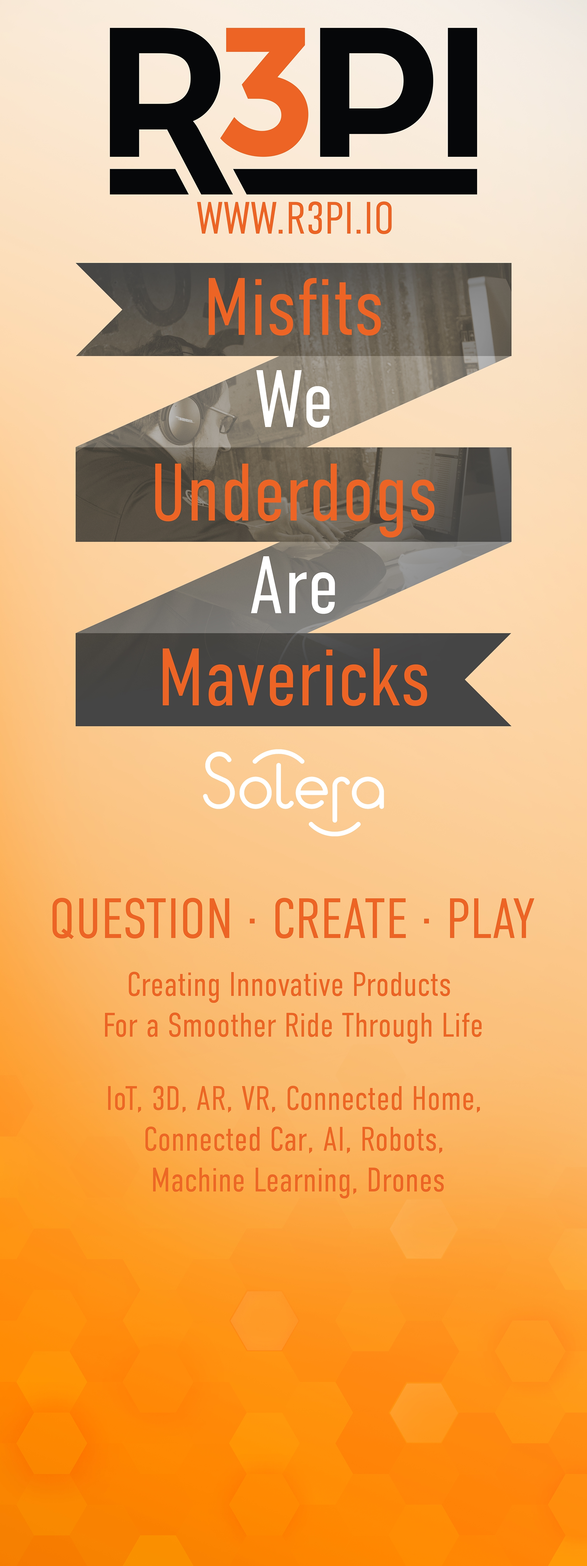
V1. Attitude first: the manifesto in ribbons, orange to the floor.Fig. 8 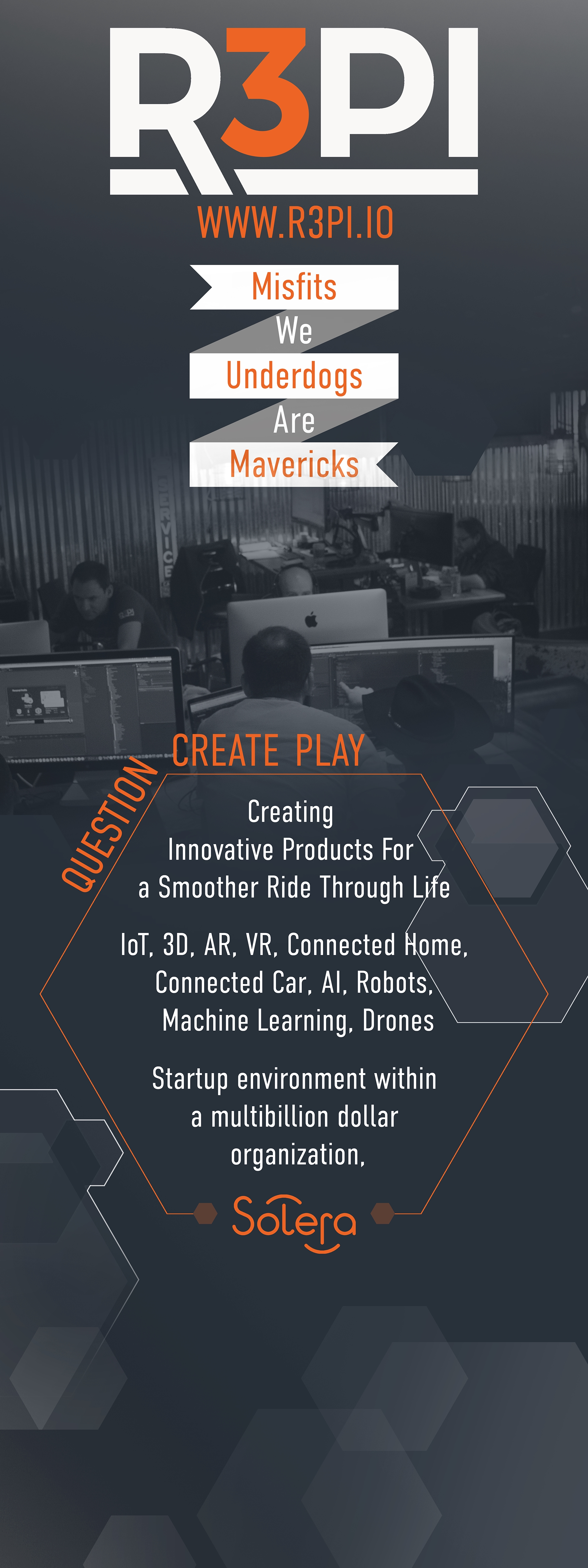
V2. Darker, with a photograph and the technology list.Fig. 9 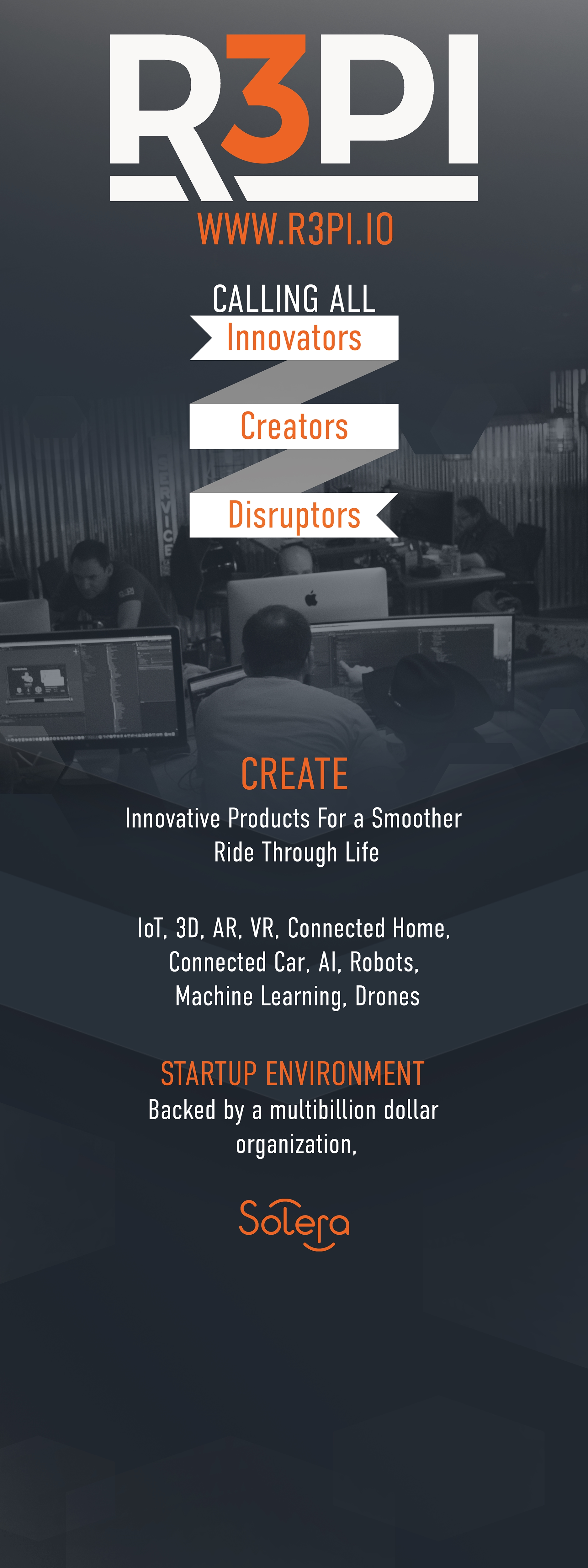
V3. The ask, sharpened: “Calling all innovators, creators, disruptors.”Fig. 10 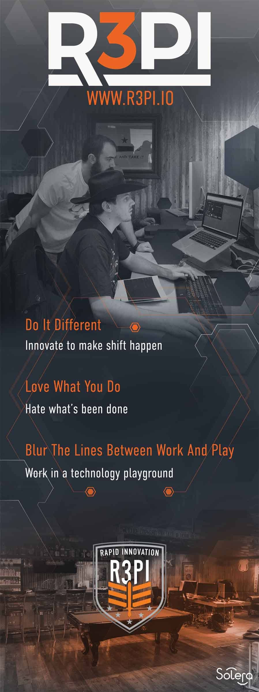
Final. Three lines, one photograph, the badge.Fig. 11 · shipped
What changed between versions
Iteration- The color came down. Orange as a field in V1 became orange as an accent by V2.
- People came in. A photograph of the lab at work replaced abstraction, and stayed.
- The words got fewer. Five ribbon words, then a technology list, then three lines that could be read from across a room.
What stayed the same
Constants- The logo and URL at the top, where a banner is seen first.
- The startup-inside-a-company idea, phrased four different ways until one held.
- The Solera mark at the foot, small, on every version.
Internal culture and executive comms
Two very different voices from the same desk, both actually sent.
Sent, not mocked“Halloween” was the whole brief for Soleraween 2017, an office campaign with a decorating night and a costume contest. Weeks earlier the brief had been the opposite register: a save-the-date from the CEO's office for a live Data Privacy Day Q&A, hosted at Twitter headquarters. Same tools, same week-long turnarounds, two audiences that would never confuse one for the other.
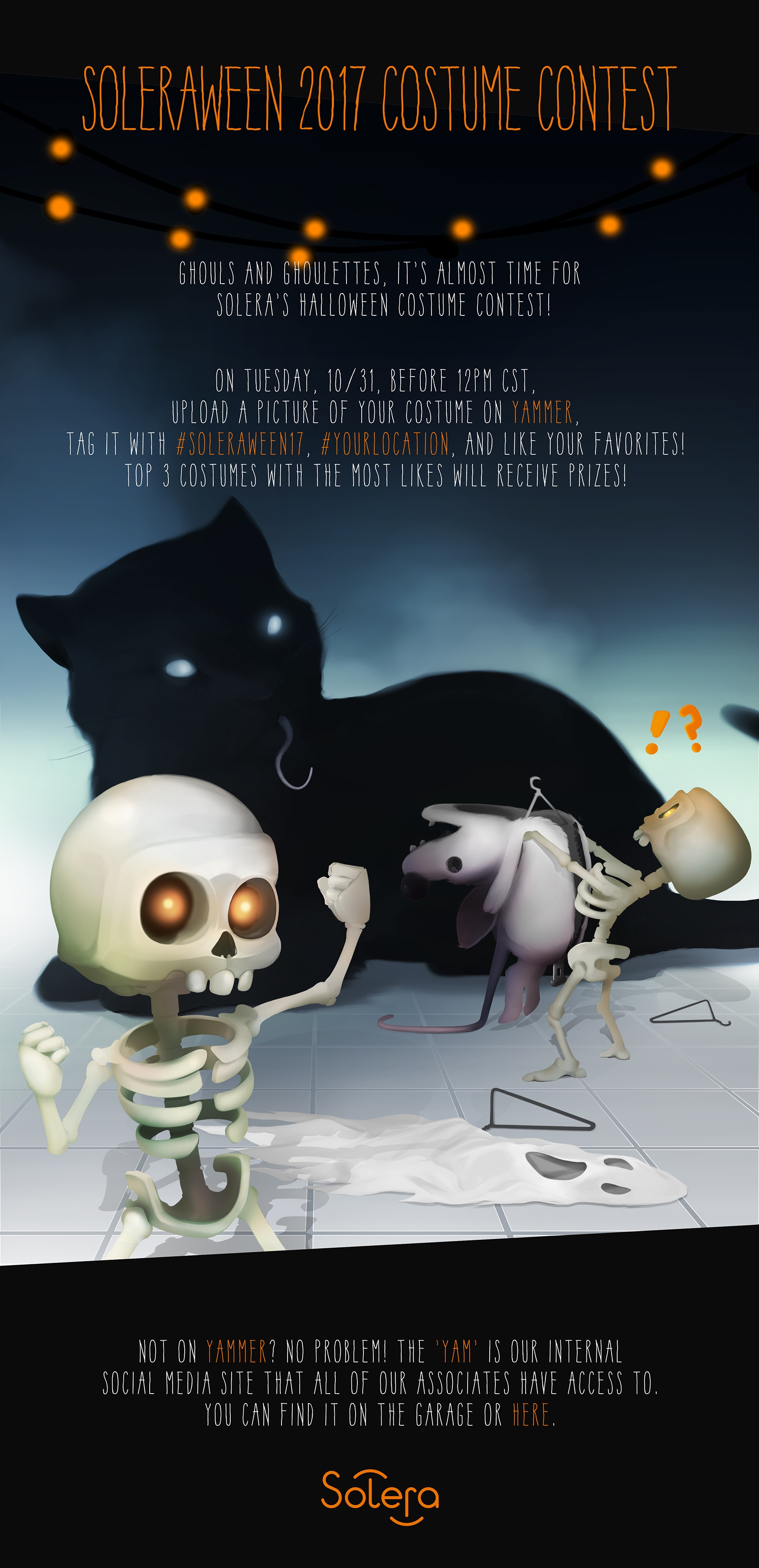
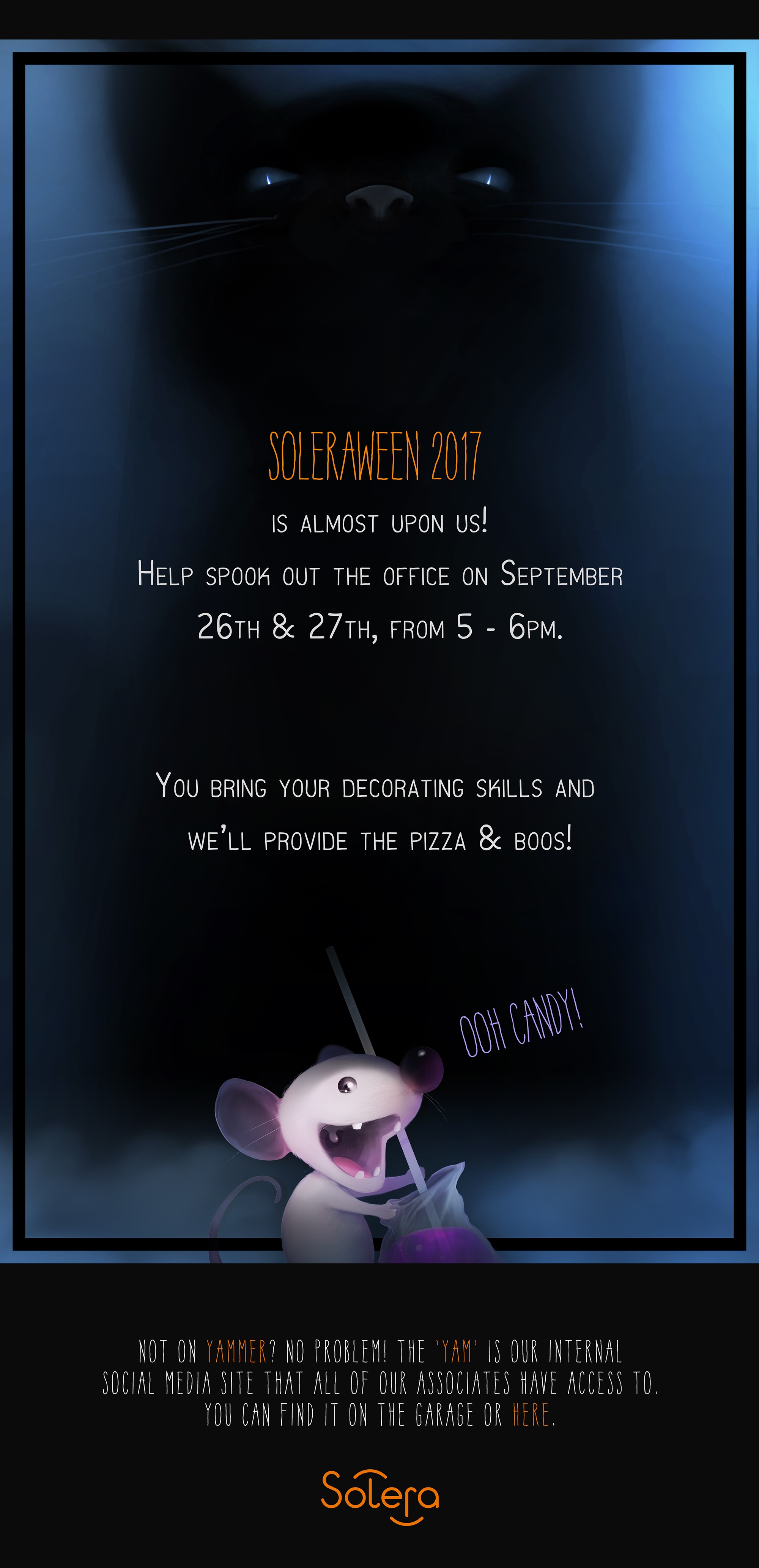
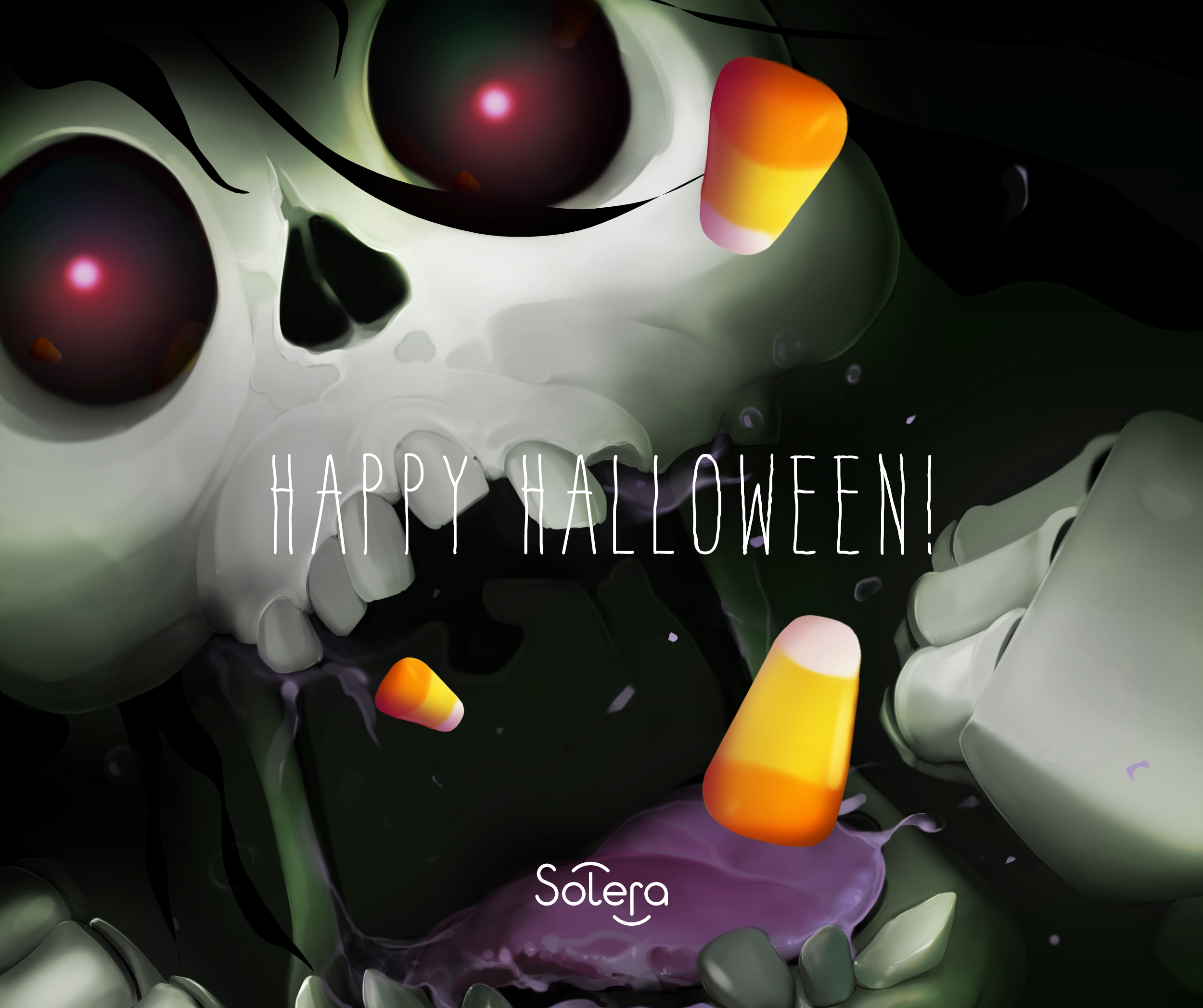

The invite had to carry the company's seriousness and its automotive identity in one frame, to an external audience, under an executive's name. The Halloween pieces had to make a few hundred colleagues smile at their desks. Nobody handed over a tone of voice for either. Reading which one the moment needed was the work.
Concept and pitch work
Proposals for products and a site that were still being decided. Shown as concepts, not shipped outcomes.
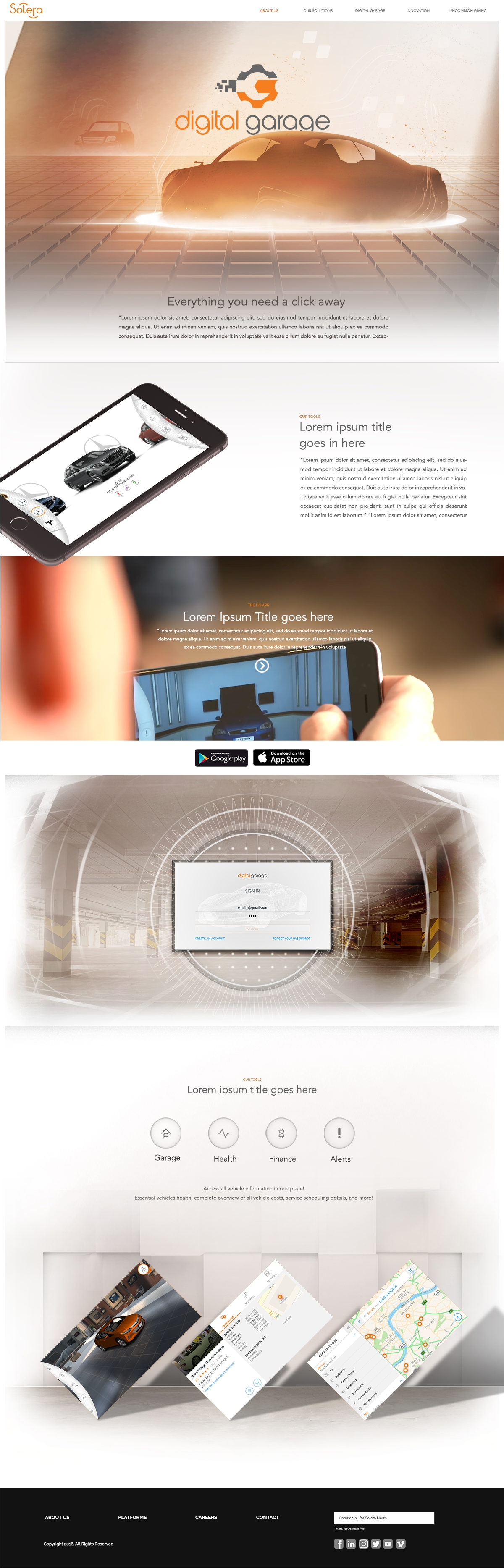
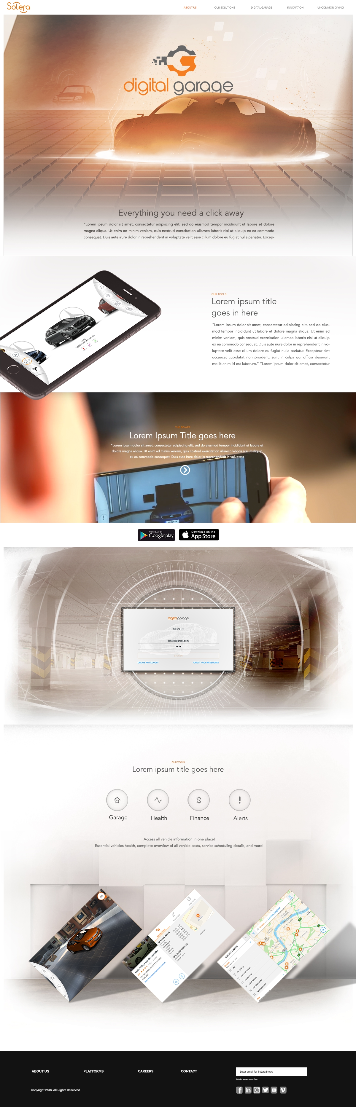
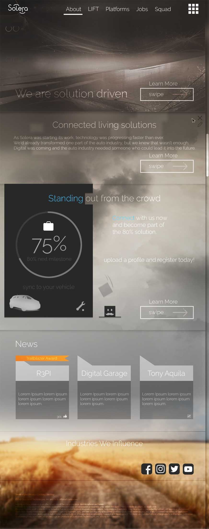
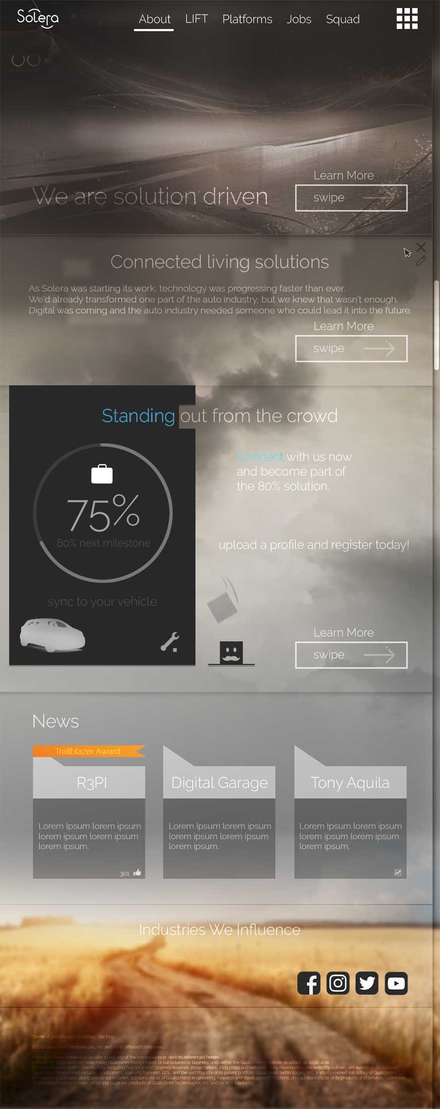
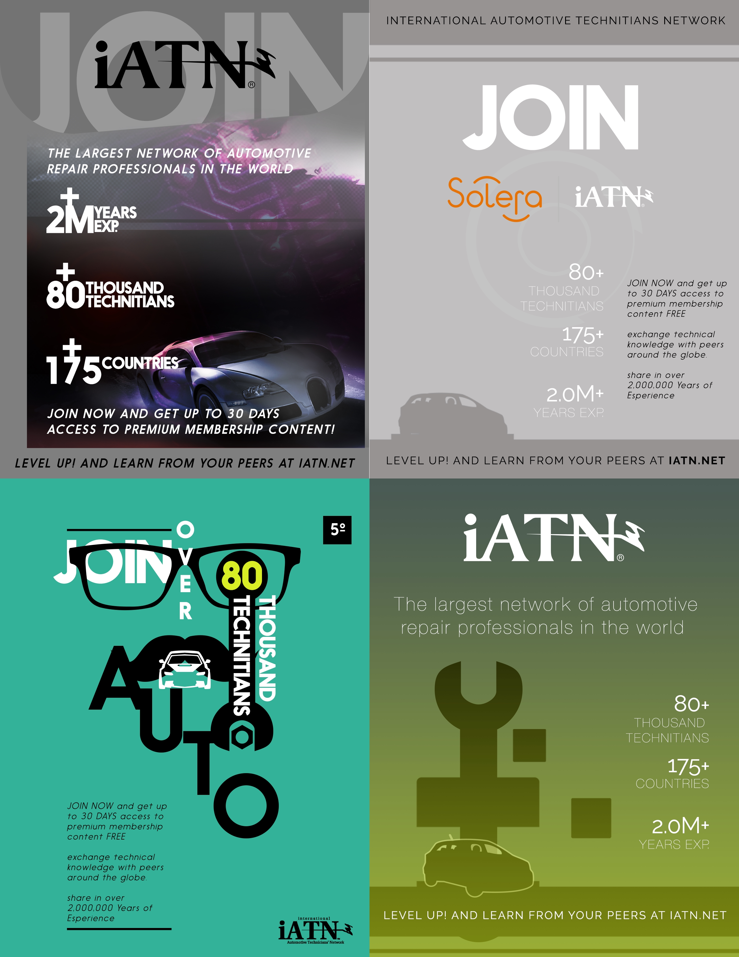
Unshipped, by designSome of the work was there to help the company decide. The corporate site was in constant flux and was pitched more than once before a direction settled; an early “Digital Garage” app concept and a “Digital Home” identity explored products that did not go on to ship; and an iATN print ad started, as ads do, as four rough directions. None of these are outcomes. They are what it looks like to give a decision something concrete to react to.
What it did
The honest outcomes: what was printed, sent, and seen.
OutcomeIn the world
ReceptionNo numbers are claimed here, because none are on record. What is on record is simpler: the banner was printed and stood at events; the Halloween campaign went to every employee; the save-the-date went out under the CEO's office to a real audience. The concept work did its job by giving decisions something to look at.
- Printed and used. The R3PI banner, after three iterations, stood in the room it was made for.
- Sent to employees. Soleraween 2017: the announcement, the contest, and the day-of post.
- Sent to guests. The Data Privacy Day save-the-date, for a live event at Twitter HQ.
- Put in front of decisions. The site, app, identity, and ad concepts, as pitches.