Awarded Google UI/UX Certification

AfterSchool

Full
1/2
Project Overview

Intended as a program for social good, research for AfterSchool first began with a benchmark of existing after school and summer programs. A broad based survey of parents and students from local schools k-12 was also conducted. The primary research questionnaire consisted of qualitative and quantitative questions that allowed participants to provide insights on their experience with their existing school programs, expectations and resources they might have, along with any concerns they may want to raise.

Initially, it was assumed that many after school programs would already be provided for by the school system. However, upon preliminary research it became clear that most students in underprivileged school districts lack access to organized programs that are both reliable and safe. There is a big need to design and provide for a comprehensive, accessible platform that reliably connects students with safe after-school opportunities.

Project Overview:

AfterSchool is a program for social good that helps connect students of all ages, backgrounds, and abilities with necessary resources and programs so that they never miss a step.

Project Duration:

May ‘24 - Aug ’24

The Problem:

Education and access to resources can often be a matter of privilege. Underprivileged students of all ages and grade levels without access to resources and after school programs tend to suffer. This often becomes more prominent during long summer breaks when growth and learning get replaced by camps and the experience of family vacations. But what about those with no where to go? How do they stay occupied in order to maintain a competitive advantage amongst their more privileged peers? A lot can be learned and accomplished in 12-16 weeks, and AfterSchool aims to bridge that gap by helping students of all ages, backgrounds, and abilities connect to opportunities and resources so that they never miss a step.

The Goal:

The goal for AfterSchool was to create an easy and accessible way to connect underprivileged youth to resources and afterschool programs outside of regular operating hours. By keeping the program inclusive, free, and accessible to all, AfterSchool could broaden its available services and resources, reaching a larger audience and assisting in the continuous development of our youth.

My Role:

Lead UX Designer & Researcher

Responsibilities:

As the lead UX designer & UX researcher my responsibilities included user research, wireframing, prototyping, usability studies, and product refinement!
Research for AfterSchool revealed that many underprivileged districts lack reliable, safe after-school programs. Surveys of K-12 parents and students showed a need for a comprehensive, accessible platform to connect families with trustworthy after-school opportunities.

Project Overview:

AfterSchool connects students of all backgrounds to essential resources and programs to support continuous growth.

Project Duration:

May ‘24 - Aug ’24

The Problem:

AfterSchool bridges the resource gap for underprivileged students, especially during summer breaks, by connecting them to opportunities that keep them learning and competitive with their peers.

The Goal:

AfterSchool’s goal is to provide a free, inclusive platform that connects underprivileged youth to after-hours programs and resources, supporting their ongoing development.

My Role:

Lead UX Designer & Researcher

Responsibilities:

As lead UX designer and researcher, I handled user research, wireframing, prototyping, usability testing, and product refinement.

User Research + Personas + Problems Statements + User Journey Maps

Understanding the User

Full
1/2
User Research Summary

Intended as a program for social good, research for AfterSchool first began with a benchmark of existing after school and summer programs. A broad based survey of parents and students from local schools k-12 was also conducted. The primary research questionnaire consisted of qualitative and quantitative questions that allowed participants to provide insights on their experience with their existing school programs, expectations and resources they might have, along with any concerns they may want to raise.

Initially, it was assumed that many after school programs would already be provided for by the school system. However, upon preliminary research it became clear that most students in underprivileged school districts lack access to organized programs that are both reliable and safe. There is a big need to design and provide for a comprehensive, accessible platform that reliably connects students with safe after-school opportunities.

Research for AfterSchool revealed that many underprivileged districts lack reliable, safe after-school programs. Surveys of K-12 parents and students showed a need for a comprehensive, accessible platform to connect families with trustworthy after-school opportunities.

Full
1/2
User Research: Pain Points
1
Lack of Access to Information & Resources
Students struggle to find relevant, up-to-date information about educational opportunities, scholarships, and extracurriculars, often due to limited internet access or digital skills.
2
Complex and Overwhelming Processes
Navigating scholarship applications and program requirements can feel overly complicated and time-consuming, especially for students balancing school, work, and family duties.
3
Inconsistent Support & Guidance
Many students lack consistent mentorship, leaving them unsure about which opportunities to pursue and how to develop the skills necessary for academic and career success.
4
Barriers in Networking
Underprivileged students often lack the social networks that connect them to mentors or industry professionals, limiting their exposure to real-world opportunities and career pathways.
1
Lack of Access to Information & Resources
Many students struggle to access timely information on opportunities due to limited internet access and digital skills.
2
Complex and Overwhelming Processes
Scholarship and program applications are often too complex and time-consuming for busy students.
3
Inconsistent Support & Guidance
Without mentorship, students lack guidance on opportunities and skill development for success.
4
Barriers in Networking
Underprivileged students often miss out on career pathways because they lack social networks and professional connections.
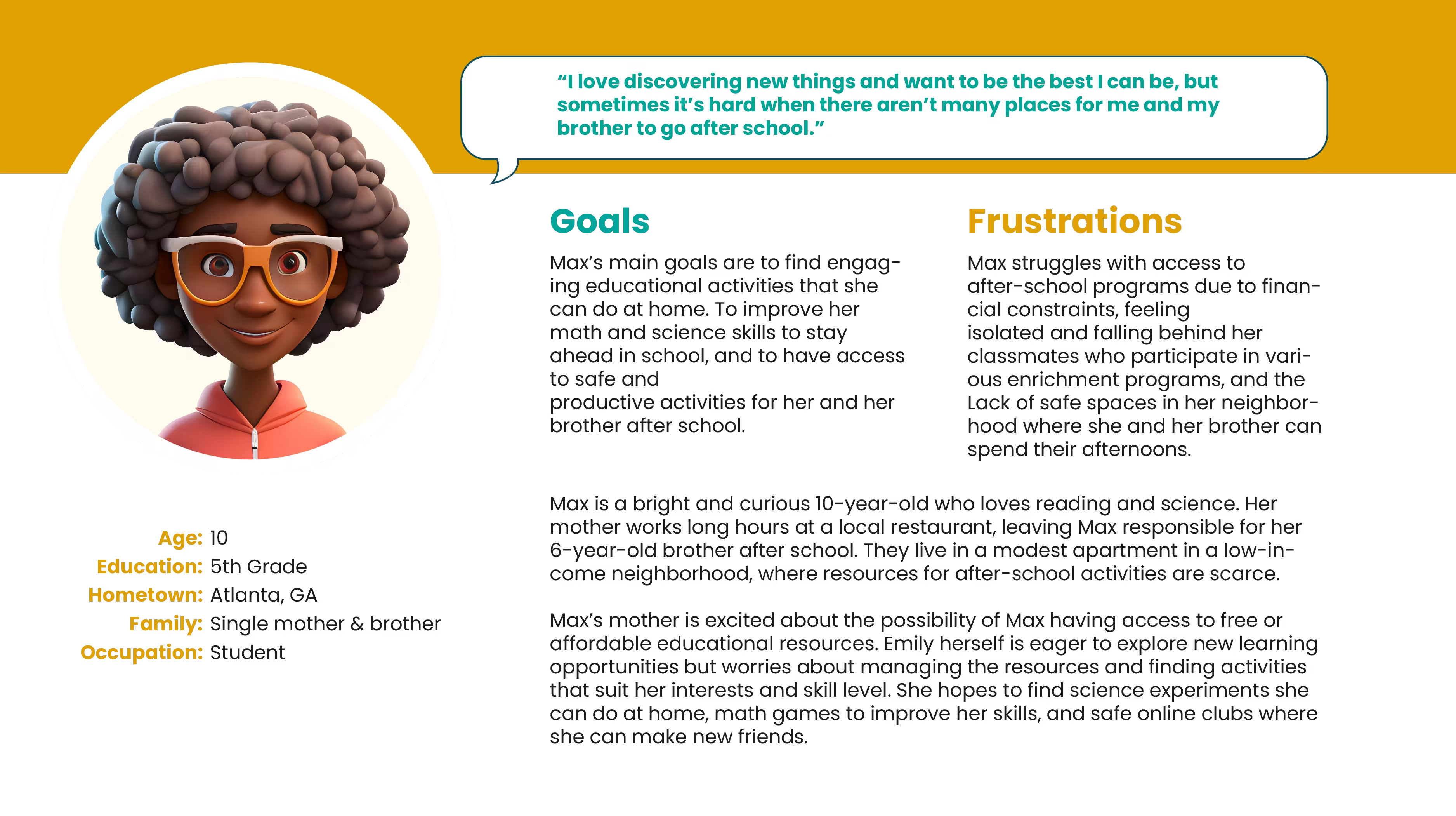
User Personas & Journey Maps: Maxine

Problem Statement:

Maxine Johnson, a 10-year-old student in a low-income neighborhood, faces challenges in accessing safe and engaging after-school activities. Her mother’s long work hours leave Max responsible for her younger brother, limiting her opportunities to participate in educational and recreational programs. This lack of resources makes it difficult for Max to stay ahead academically and find a supportive community for learning and growth.

User Journey Map:
Finding Safe Spaces!

The goal for Max and similar users is to find a safe and affordable space where she and her brother can study, learn, and engage in enriching activities together.

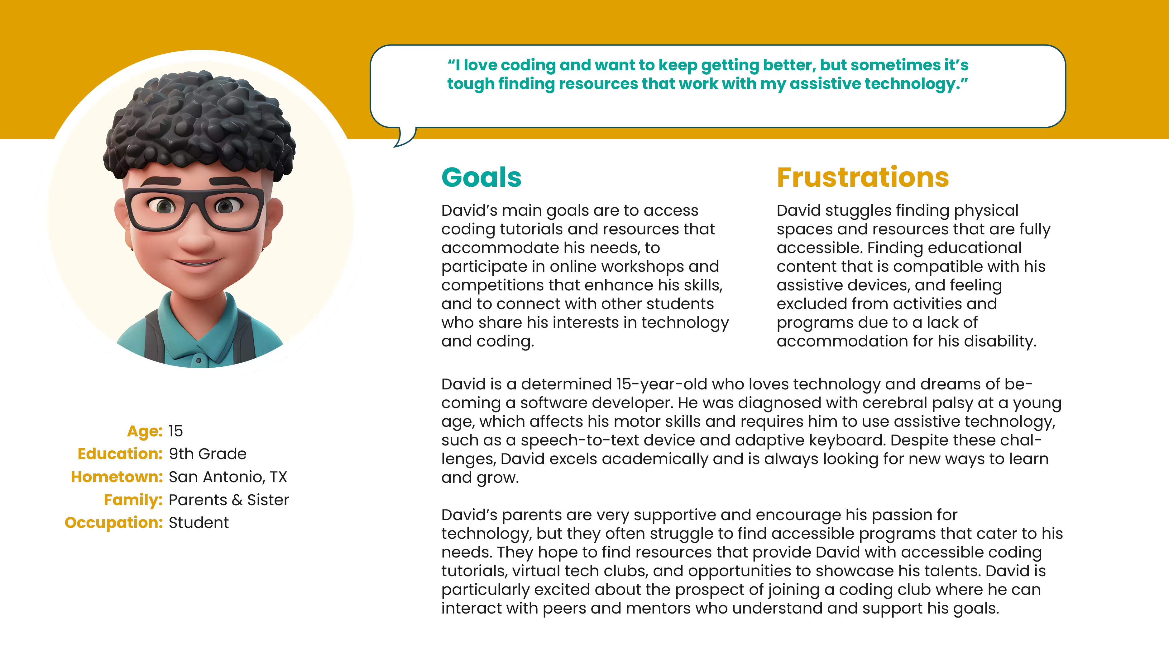
User Personas & Journey Maps: David

Problem Statement:

David Martinez, a 15-year-old student with cerebral palsy, excels academically and has a passion for coding. However, he faces significant challenges in finding accessible programs and resources that cater to his specific needs. Despite his parents’ support, David often struggles to access coding tutorials and tech clubs that accommodate his assistive technology, hindering his ability to improve his skills and connect with like-minded peers.

User Journey Map:
A Man on a Mission!

The goal for David and other similar users is to find accessible coding resources and tech communities that accommodate his needs, enabling him to improve his skills and connect with like-minded peers.

Paper Wireframes + Digital Wireframes + Low-fidelity prototype + Usability Studies

Starting the Design

Sitemap:

Building a basic site map would help as a foundational tool in the UI/UX design process. It aids in creating a well-organized, user-friendly, and scalable app, and helps in planning, communication, development, and user testing, which ultimately contribute to a more successful final product.

Information Architecture:

building an Information Architecture would become a critical step in the UI/UX design process. It would help ensure that information is organized logically and presented clearly, enhancing the user experience, improving navigation, and providing a scalable and efficient framework for future growth.

Paper Wireframes:

Taking the time to draft iterations of the AfterSchool app on paper ensured that the elements that made it to digital wireframes would be well suited to address user pain points. The goal was to keep navigation light, fun and engaging while considering users of all ages and abilities to unsure the designs were accessible and inclusive.

Digital Wireframes:

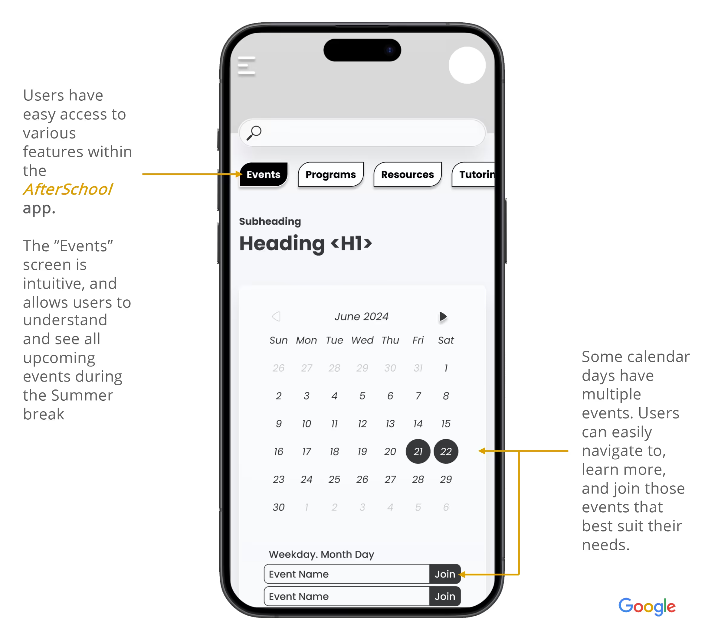
As the initial design phase continued, I made sure to base screen designs on feedback and findings from user research. A personalized experience with an emphasis on safety and security, along with strong visual navigation for accessibility and ease of use was a top priority.

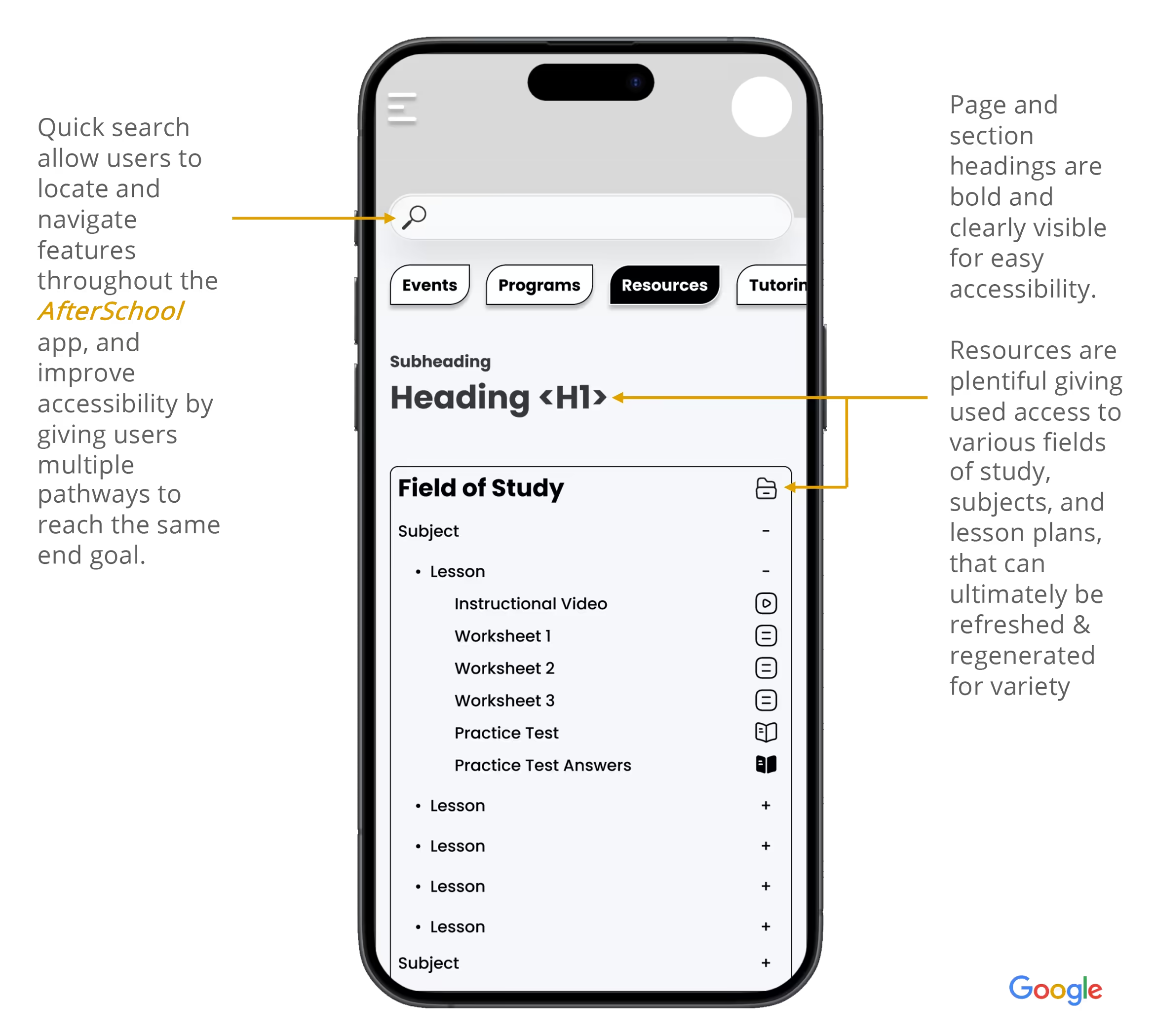
Simple and intuitive user interactions would help keep user flows streamlined. Digital wireframes strived for a clear and consistent structure, with bold headings and easy to access content. It was important to keep content both simple and diverse to address a wide array of user needs and allow the app to work well with assistive technologies.

Low Fidelity Prototype:
Full
1/2
Usability Study Findings:

5 moderated usability studies were conducted with participants ranging in age from 8-18. Most had experience using mobile devices and applications. The goal was to recruit a diverse sample of students in terms of age, gender, ability, and level of technical know-how to ensure comprehensive insights. Participants were evaluated as they made their way through 5 different prompts. The findings from each usability study (2 Rounds) have been synthesized below!

Round 1 Findings
1
The early low-fidelity prototype came with a slight learning curb, however most user were easily able to understand the general structure of the app, and proceed through the individual prompts with ease.
2
The majority of participants found the AfterSchool lo-fidelity prototype to be rather robust and well structured with regards to content and availability of features. They found the font size and contrast easy to comprehend and were easily able to navigate the main user flows within the app.
3
After observing participants make their way through various prompts it became clear that some interactions required further development to help improve user flows. Additionally, there were some sections that were identified where the user journeys could benefit from additional information including graphics or iconography
Round 2 Findings
1
Participants noted occasional delays in interactions, particularly when transitioning between screens or performing specific tasks. Incorporating smoother transitions and microinteractions, such as subtle animations or visual feedback, could enhance the app’s responsiveness and user satisfaction.
2
Some users expressed a desire for more personalized content or recommendations based on their preferences and past interactions. Introducing more tailored user experiences could increase engagement and make the app feel more relevant to individual users.
3
Some users reported feeling uncertain during the initial onboarding. Enhancing the onboarding flow with clearer guidance, simplified instructions, or a brief tutorial on first use could help new users understand the app’s key features more quickly.

Five moderated usability studies with diverse students (ages 8–18) tested prompts across two rounds, generating synthesized insights on how effectively they could navigate the app.

Round 1 Findings
1
Despite a small learning curve, most users quickly grasped the app’s structure and navigated prompts with ease.
2
Participants praised the prototype’s structure, readability, and clear user flows, finding it easy to navigate and use.
3
Testing showed that some interactions and user journeys need refinement, with added visuals or icons to improve clarity and flow.
Round 2 Findings
1
Users noticed lag during certain tasks; smoother transitions and microinteractions could improve responsiveness and satisfaction.
2
Users wanted more personalized content, suggesting tailored experiences could boost engagement and relevance.
3
Unclear onboarding left some users unsure; clearer guidance or a short tutorial could improve first-time understanding.
Mockups + High-Fidelity Prototypes + Accessibility

Refining the Design

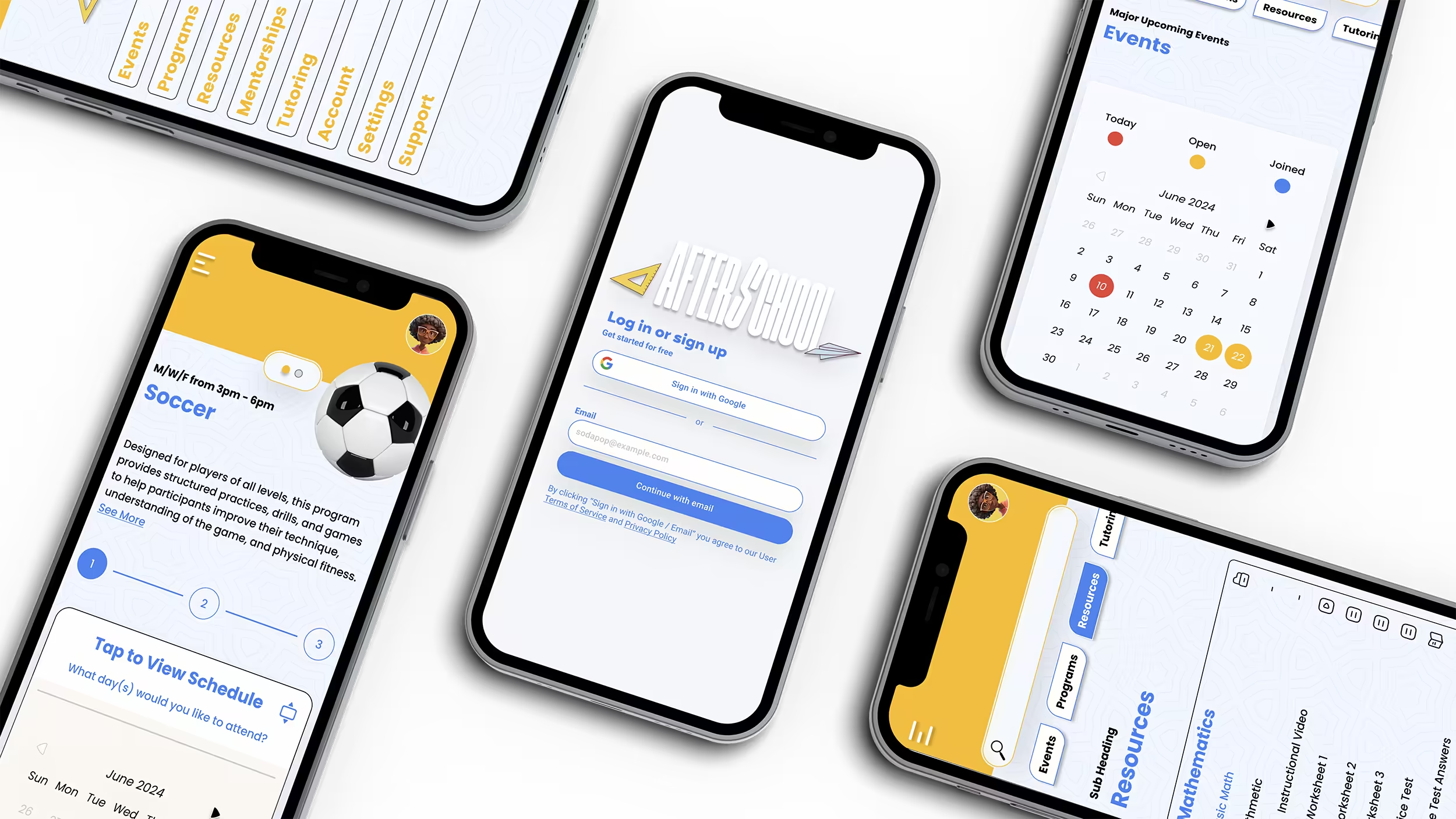
An image of several phone mockups from the Google UX Design AfterSchool project

Initial feedback showed the home screen’s navigation had a slight learning curve that participants had to overcome. This was improved by removing unnecessary content to make space for visuals and headings, building a new navigation component that users could identify with along with a virtual assistant that could help support user flows

As the initial design phase continued, I made sure to base screen designs on feedback and findings from user research. A personalized experience along with strong visual navigation for ease of use was a top priority.

Before
Usability Study
After
Usability Study

Based on feedback received from our usability studies the goal was to enhance legibility, provide a simplified user flow by removing unnecessary content and taking advantage of our mobile devices full screen space; presenting information in an easy step by step process allowing for more intuitive customization.

Before
Usability Study
After
Usability Study
Mockups!
Account
Programs
Mentors
Settings
High Fidelity Prototype:
Full
1/2
Accessibility Considerations
1
Color Contrast and Visual Accessibility
Ensure text stands out clearly from the background with high contrast, helping users with visual impairments. Also, use icons or text labels along with color to convey information, so everyone can understand the content.
2
Text Readability and Scalability
Use easy-to-read fonts with proper spacing and allow users to adjust text size to their preference, making the app easier to use for people with different visual needs.
3
Navigational Accessibility
Design simple and consistent navigation, making sure buttons, links, and menus are easy to identify and accessible with screen readers or keyboard navigation. This ensures all users can move through the app easily.
1
Color Contrast and Visual Accessibility
Use high-contrast text and pair colors with icons or labels to make content accessible to all users.
2
Text Readability and Scalability
Choose readable fonts with good spacing and let users adjust text size for better accessibility.
3
Navigational Accessibility
Create simple, consistent navigation with clear, accessible buttons and menus to support all users.
Desktop + Tablet + Smartphone

Responsive Website

Desktop Preview: Responsive Website
Tablet Preview: Responsive Website
Smartphone Preview: Responsive Website
High Fidelity Desktop Website
Takeaways + Next Steps + Lets Connect!

Going Forward

Full
1/2
Takeaways

Impact:

The AfterSchool app has been well-received by users, particularly students and educators looking for centralized access to resources and opportunities. One student shared, “I didn’t know there were this many programs out there. The app makes it easy to find stuff I actually care about.” Feedback like this shows that AfterSchool is helping reduce barriers to access by providing a user-friendly, inclusive platform that connects underserved students to tutoring, mentoring, and enrichment opportunities in a clear, intuitive way.

What I learned:

This project pushed me to take a thoughtful, research-driven approach to UI/UX design. I developed user personas, journey maps, and scenarios to better understand the challenges faced by under-resourced students. From there, I designed wireframes and interactive prototypes, iterating based on feedback from multiple rounds of usability testing. I focused heavily on information hierarchy, accessibility, and mobile-first layouts to ensure that users could navigate the app with ease. I also gained experience creating responsive components and variants in Figma, while exploring how AI-assisted tools can streamline layout design and improve consistency across breakpoints.

Impact:

Users praised AfterSchool for its inclusive, user-friendly design that makes it easy to discover and access tutoring, mentoring, and enrichment opportunities.

What I learned:

I applied a research-driven approach, creating personas, journey maps, wireframes, and prototypes, while focusing on accessibility, mobile-first layouts, and responsive design in Figma, refined through usability testing.

Full
1/2
Next Steps
1
To further improve accessibility, I plan to implement descriptive alt text, keyboard navigation options, and better contrast ratios across screens. I’ll also refine heading structure in Figma’s Dev Mode to ensure proper hierarchy and clarity during developer handoff.
2
A guided onboarding experience could help first-time users quickly understand the core features of the app, such as scheduling mentoring sessions or bookmarking events. A brief walkthrough or tooltips would help reduce friction and boost confidence for new users.
3
Lastly, I plan to continue testing app performance across devices. Improving loading times and optimizing responsiveness especially for students with older phones or limited internet access will be key in ensuring AfterSchool remains inclusive and accessible for all users.
1
Planned improvements include adding alt text, keyboard navigation, stronger contrast, and clearer heading structure for better accessibility and developer handoff.
2
Adding guided onboarding with walkthroughs or tooltips would help new users learn key features quickly and confidently.
3
Ongoing testing and performance optimization will ensure AfterSchool stays fast, responsive, and accessible on all devices, including older phones with limited internet.

Contact me

Looking to partner or work together?

selimoaziz@gmail.com

Thank you! Your submission has been received!
Oops! Something went wrong while submitting the form.