Awarded Google UI/UX Certification

Cup & Cone

User Research Summary

Research for the Cup & Cone franchise began with a benchmark of existing food truck vendors. A broad based survey of street food connoisseurs and locals within the cities of Cincinnati, Dayton, and Columbus Ohio was also conducted. The primary research questionnaire consisted of qualitative and quantitative questions that allowed participants to provide insights on their experience with the local cuisine and the food trucks they had become familiar with.

Initially, it was assumed that those familiar with Cup & Cone  would want the franchise to remain traditional, however, assumptions changed and it not only appeared that consumers were interested in but also excited by the new products and services that modernization of the franchise would provide.

Project Overview:

Cup & Cone is a mobile food truck franchise based in and around the cities of Cincinnati, Dayton, and Columbus Ohio. They hope to expand their business and reach more customers with a mobile food ordering app.

Project Duration:

January ’24 – Mar ‘24

The Problem:

Cup & Cone was looking to expand their business, which operated mainly through word of mouth, recommendations, and local know how. They had no digital footprint and hoped that by translating and adapting their business into the digital age that they could find new footing and reach more customers.

The Goal:

The goal for Cup & Cone was to take their existing food truck franchise and digitize their business. By elevating their customer experience they wanted to expand upon their product(s), offering new services, and thereby further develop their customer base.

My Role:

Lead UX Designer & Researcher

Responsibilities:

By elevating their customer experience they wanted to expand upon their product(s), offering new services, and thereby further develop their customer base.

User Research + Personas + Problems Statements + User Journey Maps

Understanding the User

User Research Summary

Research for the Cup & Cone franchise began with a benchmark of existing food truck vendors. A broad based survey of street food connoisseurs and locals within the cities of Cincinnati, Dayton, and Columbus Ohio was also conducted. The primary research questionnaire consisted of qualitative and quantitative questions that allowed participants to provide insights on their experience with the local cuisine and the food trucks they had become familiar with.

Initially, it was assumed that those familiar with Cup & Cone  would want the franchise to remain traditional, however, assumptions changed and it not only appeared that consumers were interested in but also excited by the new products and services that modernization of the franchise would provide.

User Research: Pain Points
1
Limited Accessibility & Time Constraints
Users struggle to physically visit the food truck due to time constraints and/or irregular schedules. Language barriers, dyslexia, and accessibility are additional concerns
2
Digital Convenience & Ordering Efficiency
Users need digital solutions that include online ordering, digital payment options, and streamlined platforms. An efficient process to help manage schedules and responsibilities
3
Understanding & Accessibility
Language barriers, visual impairments, and/or time constraints present difficulties in understanding emphasizing a broader need for transparent & accessible menu details
4
Desire for Flexibility & Convenience
Users want flexibility, whether it’s pre-ordering to save time, exploring new options conveniently, or accommodating varying schedules
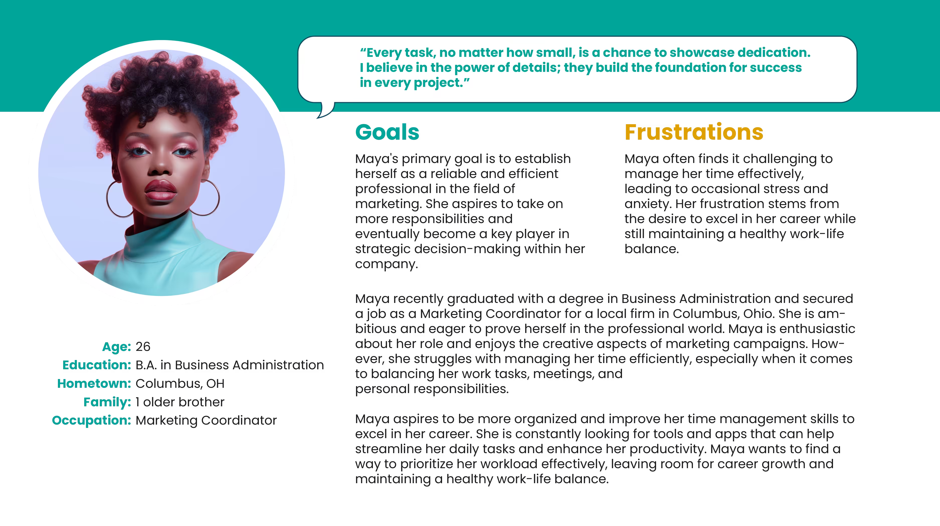
User Personas & Journey Maps: Maya

Problem Statement:

Maya is a recent graduate with a degree in Business Administration who needs efficient time management tools and strategies because she wants to excel in her role as a Marketing Coordinator, showcasing her dedication to both minor tasks and strategic campaigns.

User Journey Map:
Order for Pickup!

The goal for Maya and similar users looking to improve their time management skills, streamline tasks, and improve their productivity was to provide a level of service and accessibility that gave users greater ownership over their daily tasks and the ability to manage a healthy work-life balance. Order for pickup, anyone?

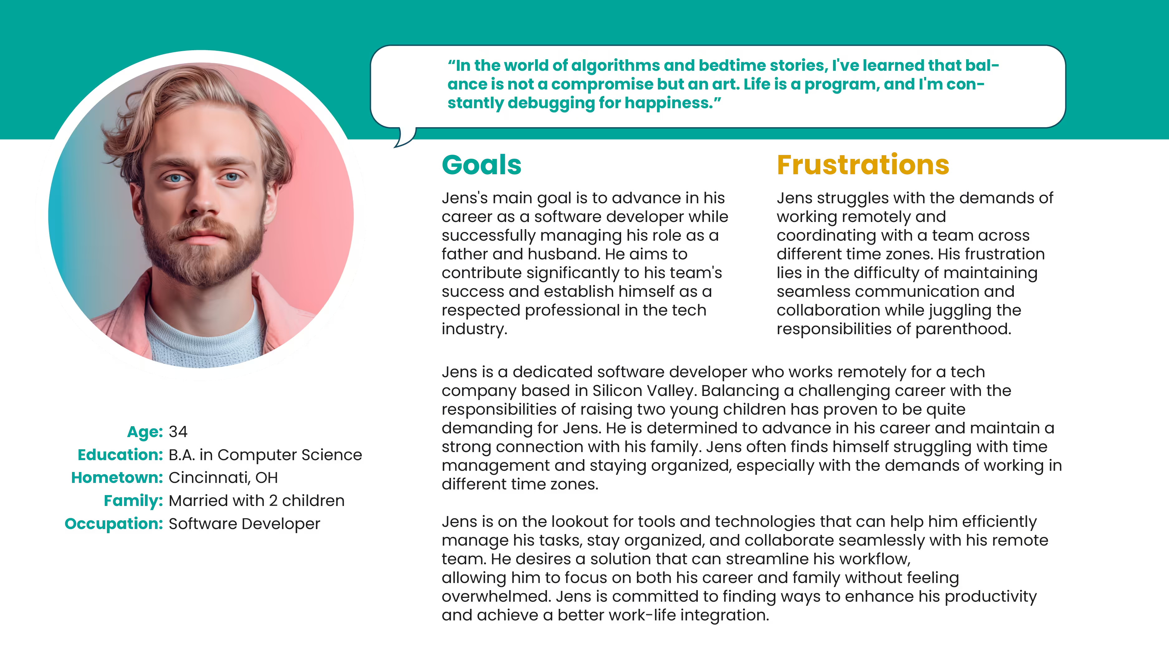
User Personas & Journey Maps: Jens

Problem Statement:

Jens is a dedicated software developer and father of two who needs streamlined collaboration tools and effective time zone management solutions because he aspires to advance in his career while successfully balancing the demands of remote work and family responsibilities.

User Journey Map:
Cater an Event!

The goal for Jens and similar users looking to efficiently manage their tasks and stay organized was to provide a level of service and accessibility that was accommodating to those managing teams, working remotely, and who strive for greater work life balance and management over their busy schedules. Who wants Cup & Cone for their birthday?

Paper Wireframes + Digital Wireframes + Low-fidelity prototype + Usability Studies

Starting the Design

Paper Wireframes

Taking the time to draft iterations of the Cup & Cone app on paper ensured that the elements that made it to digital wireframes would be well suited to address user pain points. The goal was to keep navigation light, fun and engaging while taking hints from games and gamified app design.

Information Architecture:

building an Information Architecture would become a critical step in the UI/UX design process. It would help ensure that information is organized logically and presented clearly, enhancing the user experience, improving navigation, and providing a scalable and efficient framework for future growth.

Sitemap:

Building a basic sitemap would help as a foundational tool in the UI/UX design process. It aids in creating a well-organized, user-friendly, and scalable app, and helps in planning, communication, development, and user testing, which ultimately contribute to a more successful final product.

As the initial design phase continued, I made sure to base screen designs on feedback and findings from user research. A personalized experience along with strong visual navigation for ease of use was a top priority.

Simple and flexible user interactions would keep user flows streamlined, allowing for the digital wireframes to be more convenient and engaging while also equipping the app to work well with assistive technologies.

Low Fidelity Prototype:
Usability Study Findings:

5 moderated usability studies were conducted with participants ranging significantly in age, ability, and experience. Participants were evaluated as they made their way through 5 different prompts. The findings from each usability study (2 Rounds) have been synthesized below!

Round 1 Findings
1
Early prototype navigation came with a slight learning curve that some older participants took time adjusting to.
2
The majority of participants claimed that the font sizing and contrast was somewhat difficult to comprehend and were slightly overwhelmed by the amount of content within certain user flows
3
The majority of participants claimed that the font sizing and contrast was somewhat difficult to comprehend and were slightly overwhelmed by the amount of content within certain user flows
Round 2 Findings
1
Several participants complimented the Cup & Cone aesthetic as being playful and unique in comparison to other apps offering similar services. The unique  iconography helped in many ways to simplify content and increase ease of use
2
Participants found the Cup & Cone app simple and ease of use. They appreciated the  step by step processes, appreciated the various ways in which they could customize orders both large and small
3
Participants liked the stages of flexibility to change orders and items in their shopping bag, along with a feature that allowed them to quickly reorder from their purchase history
Mockups + High-Fidelity Prototypes + Accessibility

Refining the Design

Initial feedback showed the home screen’s navigation had a slight learning curve that participants had to overcome. This was improved by removing unnecessary content to make space for visuals and headings, building a new navigation component that users could identify with along with a virtual assistant that could help support user flows

As the initial design phase continued, I made sure to base screen designs on feedback and findings from user research. A personalized experience along with strong visual navigation for ease of use was a top priority.

Before Usability Study
After Usability Study

Based on feedback received from our usability studies the goal was to enhance legibility, provide a simplified user flow by removing unnecessary content and taking advantage of our mobile devices full screen space; presenting information in an easy step by step process allowing for more intuitive customization.

Before Usability Study
After Usability Study
Mockups!
Navigation
Menu
Build
Shopping Bag
High Fidelity Prototype:
Accessibility Considerations
1
Color Contrast and Visual Accessibility
Ensure text stands out clearly from the background with high contrast, helping users with visual impairments. Also, use icons or text labels along with color to convey information, so everyone can understand the content.
2
Text Readability and Scalability
Use easy-to-read fonts with proper spacing and allow users to adjust text size to their preference, making the app easier to use for people with different visual needs.
3
Navigational Accessibility
Design simple and consistent navigation, making sure buttons, links, and menus are easy to identify and accessible with screen readers or keyboard navigation. This ensures all users can move through the app easily.
Takeaways + Next Steps + Lets Connect!

Going Forward

Takeaways

Impact:

The Cup & Cone app has received positive feedback from users, with participants praising its intuitive design and seamless ordering process. One user shared, “I love how easy it is to order my favorite desserts, and the app makes it so convenient to pick up from different locations—this is exactly what we needed!” This feedback highlights the app’s effectiveness in meeting user needs and enhancing the overall dessert ordering experience.

What I learned:

Throughout this project, I developed personas, user stories, and user journey maps to better understand and empathize with users, which guided my design decisions. I conducted usability studies, tested and iterated on designs based on real user feedback, and created wireframes and prototypes to visualize and refine the Cup & Cone app. This process helped me build a professional portfolio and gain experience in using design systems, components, and variables in Figma to prototype effectively. Additionally, I explored how AI tools can boost productivity by streamlining tasks, allowing me to focus more on the creative and iterative aspects of my design work.

Next Steps
1
A next step for improving accessibility could involve implementing alternative text for images, optimizing color contrast, enhancing micro-interactions for better user feedback, and properly labeling headings, subheadings, and body text in Figma’s Dev Mode. This would ensure a smooth handoff to developers with clear specifications for accessibility and design consistency.
2
Additionally, next steps could simplify and improve the onboarding process for new users by providing a quick walkthrough or tutorial when they first open the app. This could help users understand key features and reduce the learning curve, ensuring they can start using the app with ease and confidence.
3
Lastly, future improvements could evaluate and optimize the app’s performance, especially load times and responsiveness. A faster, more seamless experience will improve user satisfaction, reduce abandonment rates, and enhance overall usability, particularly for users with limited internet connectivity or slower devices.
Lets Connect!